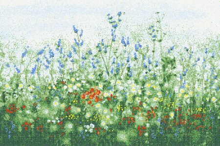
The New Neutrals
by Ariel Schuster, Residential Design Consultant at Artaic
I think it’s safe to say that in this day-and-age we need become more cognizant our surroundings, and our immediate surroundings are our homes. As more and more of us adjust to the “new-normal” of working from home, we have shifted our gaze inside and become more critical of our own spaces. We design our homes to bring us shelter, peace, and comfort – but this serenity doesn’t need to translate into blasé white, beige, or grey. Bring new life to your space with subtle color – the “new neutrals”.

Featured above, Emulsion in a custom colorway, from our SPLASH! collection.
The “greige” trend has seen better days. Yes, neutrals are organic colors. Yes, they complement many different styles and colors. Don’t let the ease of neutrals persuade you because they are not the only players in the game. Enter the new neutrals; a pigmented color that has been touched ever so slightly by your “traditional” neutral. Chalky, milky, muted hues, soft pastels – timeless with a twist! Neutral doesn’t have to mean absent of color, and with that it’s time to bring life and energy to your space with these new neutrals. It’s time to create the mood you want to live in, and for a-lot of us, work in too!
Let’s talk about myths and misconceptions when it comes to color. Yes, white looks clean, and it goes with everything – but what you may be failing to consider is that a soft color can actually drive the design direction of your space by opening up a whole palette that you may not have previously considered. Picture a pale pink wall: stage in front of it a rich cognac leather sofa boldly featuring navy and fuchsia cut-velvet pillows. Suddenly that pale pink feels quiet and soft. Don’t be fooled – the color is there! There is another misconception that color can make a room feel smaller, but let me dispel that once and for all. A soft, subtle color is actually going to create depth in your space as it will play with, and absorb the natural light throughout the day, making the color truly dynamic.
While I personally have always been one for color, if you are married to the “greige” life there are little ways to step outside of your comfort zone and refresh your space. Go ahead – paint the walls white, but why not elevate the space with a soft, muted feature wall mural in a blue-grey palette? How about punching up the powder room with an easy to clean peachy-pink blend? What about an organic pattern of grey-greens on the patio, bringing the outside-in? Take a note or two from our design Lore Pistachio, featured below – subtle, yet full of color.


Love a design but not sure about the permanency of an installed mosaic? Ask us about framing – a design that’ll fit seamlessly within your space, yet movable to enjoy anywhere you go. Featured above, Spire Lavender from our Flourish collection.
Need more design ideas? I’m here to help! Send me an email at ariel@artaic.com, or give me a call at 1.508.523.7922.
Residential Design Consultant


