Design tips: How to avoid the clichés while designing for fall
It may seem like summer has only just begun; yet the leaves are bound to change as September creeps closer into the forefront. Pretty soon it will be time to start relinquishing the tight grip on summer and dive into the fall aesthetic. Though beautiful, autumn can be filled with clichés and finding original inspiration can be tough in a sea of crunchy leaves and apple cider. Here are some design trends and inspirations to help any designer’s ideas shine the brightest:
Pantone’s Fall 2016 Collection was released and it’s awesome!
PANTONE recently came out with its Fall collection and has created a delightfully unexpected take on the fall pallet. Instead of burgundies, yellows and oranges, PANTONE has leveraged earth tones and vivacious pops of color to highlight an overall sense of tranquility, strength, and optimism.

These unexpectedly vivacious colors in our Fall 2016 palette act as playful but structured departures from your more typical fall shades.
Blue skies represent constancy as they are always above us. Grays give a feeling of stability, Red tones invite confidence and warmth, while the hot Pinkish Purples and Spicy Mustard Yellows suggest a touch of the exotic.
-Leatrice Eisman, Executive Director of the Pantone Color Institute™
Become the next trendsetter within the design-sphere and take a peek at some of the rooms, as well as accents, utilizing the pantone fall collection below:
Sharkskin | PANTONE 17-3914
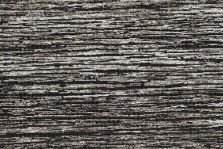
Aratic Waterflow Titanium Mosaic | Design By KBH
Warm Taupe | PANTONE 16-1318
Artaic SG-582 Sintered Glass Tile | Wood Tile by Filippo Manuzzi | Lighting by Friends&Founder
Spicy Mustard | PANTONE 14-0952
The World of Interiors | Artaic UP-359 Unglazed Porcelain Tile | Design by Arne Jacobsen
Riverside | PANTONE 17-4028
Polly Eltes Photography| Kitchen by Neptune | Artaic VG – M699 Vitreous Glass Tile
Potter’s Clay | PANTONE 18-1340
Bedroom by HouseBeautiful | Artaic SG-553 Sintered Glass Tile | Source Unknown
Airy Blue | PANTONE 14-4122
Kitchen by KBH | Coffee Shop by Terry Design | Artaic UP-293 Unglazed Porcelain Tile
Aurora Red | PANTONE 18-1550
Room designed by AMR designers | Artaic SG-552 Sintered Glass Tile
Bodacious| PANTONE 17-3240
Room designed by Lindsey Coral Harper | Artaic VG-M726 Metallic Vitreous Glass Tile
Dusty Cedar | PANTONE 18-1630
Light by Dusk light| Design by Vani Archive| Artaic VG-M758 Metallic Vitreous Glass Tile
Lush Meadow | PANTONE 18-5845
Wallpaper by MadebyLemon | Design by source unknown | Artaic VG-O630 Opalescent Vitreous Glass Tile
Turn heads with a Tone-on-tone designed space
Tone-on-tone palettes are beautiful within its simplicity and impactful nature. Defined as a color pallet consisting of one color and its hues, designers who utilize tone-on-tone this season will turn heads with their color expertise. The concept, though old, is now back in style and better than ever. Using colors within the same family, you can create a luxurious yet cozy infusion, and even produce an impactful feeling on any passer-by, leaving them to linger and escape the cold autumn air.
Tile accents
This unique feature has endless possibilities and color combinations. The pictures below are only a few of the unlimited options:
- Dana Miller
Feel inspired yet?
Autumn is here and the the possibilities to stand-out from a crowd are endless. Tile is a strong option and can be utilized perfectly for designing.
Whether its color or design, Artaic’s mosaics provides a unique accent to any space. Think outside the box for this coming fall and contact us for a free design consultation.


